SPC (Statistical Process Control) Analysis Software
Developed using web technologies, it enables the instant display of quality-related charts similar to Minitab directly in the browser. It supports multiple data source input methods, simplifies data entry processes, automatically reads device data, and quickly generates charts for real-time analysis. This replaces cumbersome data entry, allowing data to be more intuitively and effectively communicated in analysis results.
Supports multiple data source input methods, quickly generating charts for analysis. It also supports customization features.
We also support AI-based analysis methods, quickly identifying data anomalies for quality decision-making.
Customizable Implementation of Minitab Quality Module Algorithms
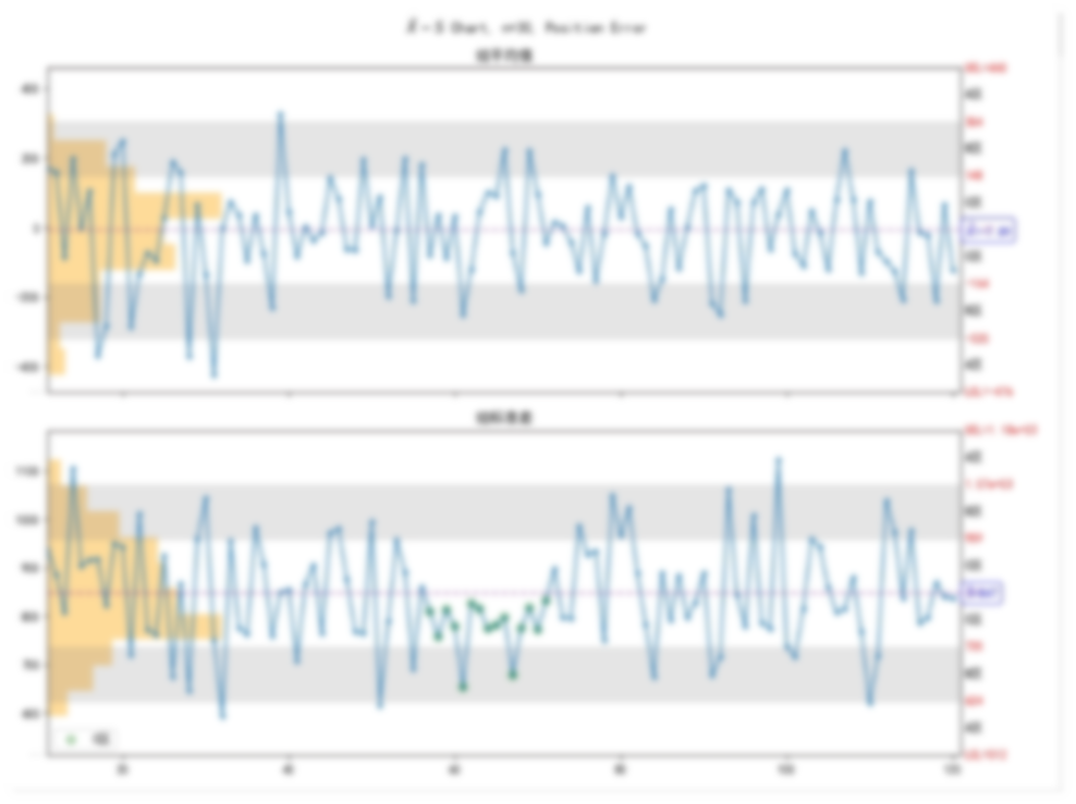
- Supports various SPC control charts
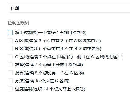
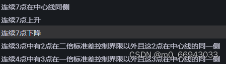
- Free selection of various control chart rules
- Out of control limits (one or more points beyond control limits)
- Area A (2 out of 3 consecutive points are in Area A or further)
- Area B (4 out of 5 consecutive points are in Area B or further)
- Area C (7 consecutive points on one side of the average line in Area C or further)
- Trend (7 consecutive points showing an upward or downward trend)
- Mixture (8 consecutive points with none in Area C)
- Stratification (15 consecutive points in Area C)
- Over-control (14 consecutive points alternating up and down)
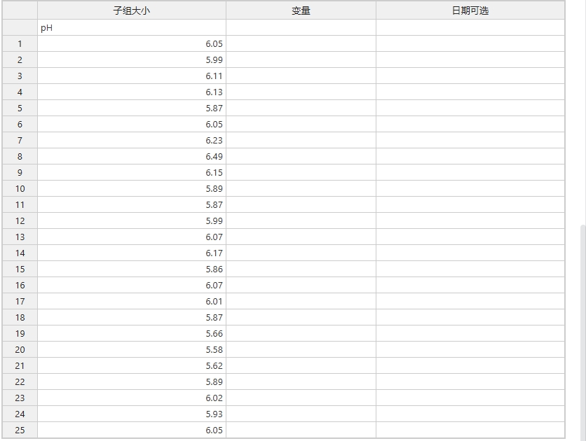
- Data can be manually entered or automatically input via an interface
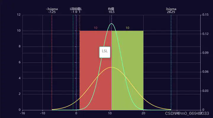
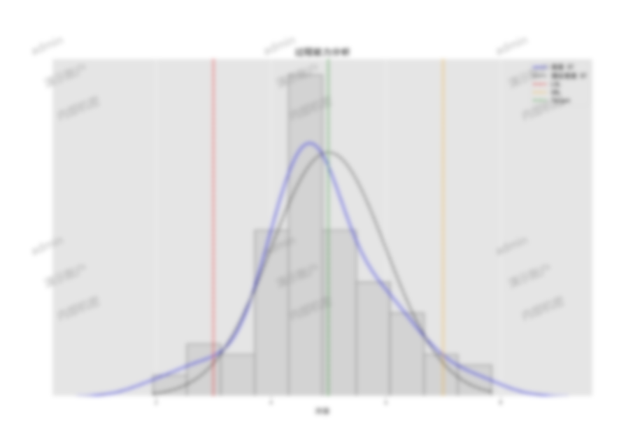
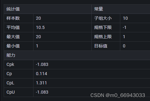
- Cpk measures a process’s ability to produce outputs within specified limits. It indicates the center of the process output between specification limits and the variability in the process.
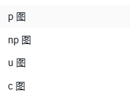
- C chart is used to monitor the number of defects per unit in a process. It helps identify changes in the number of defects when sample sizes remain constant.
- DPMO is a performance metric for processes, calculating the number of defects per million opportunities, providing a standardized way to compare processes of varying complexities.
- NP chart is used to monitor the number of nonconforming items in a process when the sample size is constant. It helps track changes in defect proportions over time.
- P chart is used to monitor the proportion of nonconforming items in a process when sample sizes vary. It helps identify changes in defect rates over time.
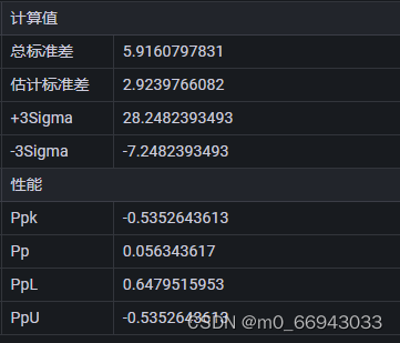
- Ppk measures the performance of a process over time, considering both the mean and variability of the process. It shows the capability of process output under actual operating conditions.
- U chart is used to monitor the number of defects per unit in a process when the sample size varies. It helps identify changes in defect numbers under different sample sizes.
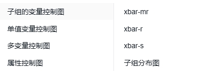
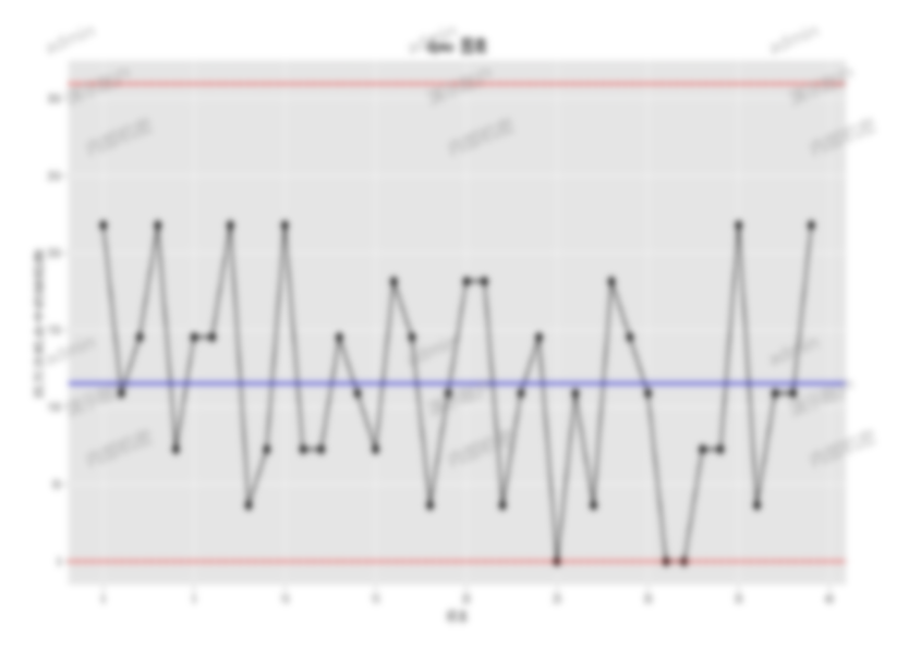
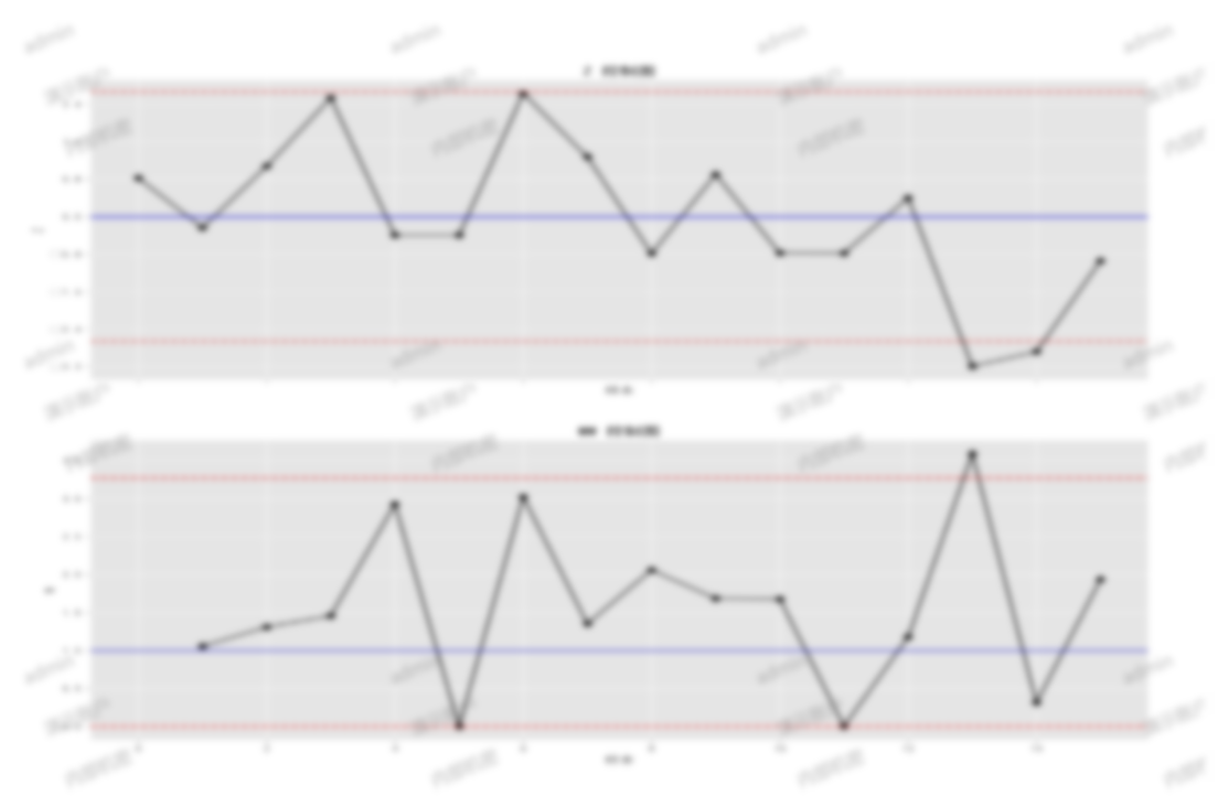
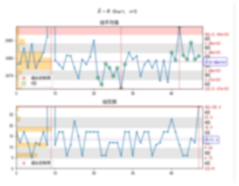
- Xbar-R chart is used to monitor changes in the process mean (Xbar) and range (R). It helps identify shifts in the process center and variability over time.
- Xbar-S chart is used to monitor changes in the process mean (Xbar) and standard deviation (S). It helps identify shifts in the process center and variability over time.
- XMR chart is used to monitor changes in individual values (X) and moving ranges (MR). It helps identify changes in individual data points and their variability over time.
- Zbar-W chart is used to monitor changes in the weighted mean (Zbar) and weighted range (W). It helps identify changes in weighted data over time.
- Zm-W chart is used to monitor changes in the weighted median (Zm) and weighted range (W). It helps identify changes in weighted median data over time.
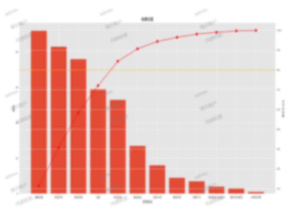
- Pareto chart helps identify the most important issues or defects by arranging them in order of defect frequency. Based on the Pareto principle, it shows that a small number of important defects account for the majority of problems.
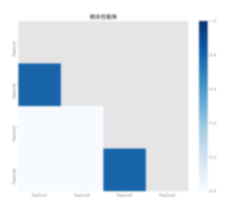
- Correlation matrix displays the linear relationship between variables, helping to identify which variables have significant correlations. This is useful for multivariate analysis and modeling.
- Group average range chart monitors the average range across different groups, helping to identify variability between groups.
- Group average standard deviation chart monitors the average standard deviation across different groups, helping to identify variability between groups.
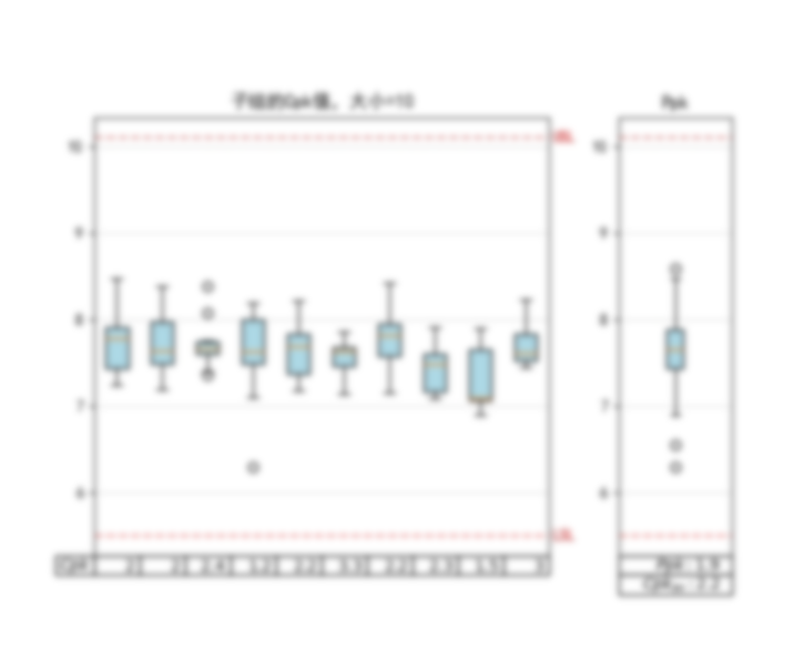
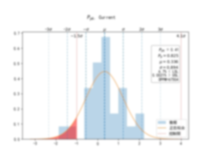
- Process capability analysis evaluates a process’s ability to meet specification requirements. It includes indicators like Cp, Cpk, Pp, and Ppk, helping to identify opportunities for process improvement.
- Mean run chart, also known as Xbar-R chart, monitors changes in subgroup means and ranges within a dataset. It helps identify changes in process central tendency and variability over time.
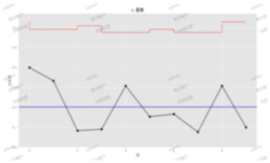
Sample run charts
CPK analysis charts, and many other analysis graphics
Control items
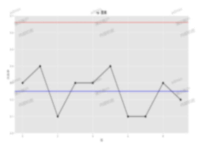
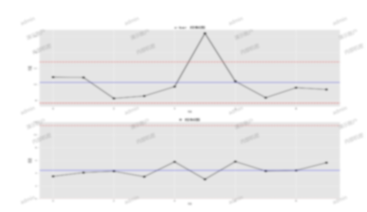
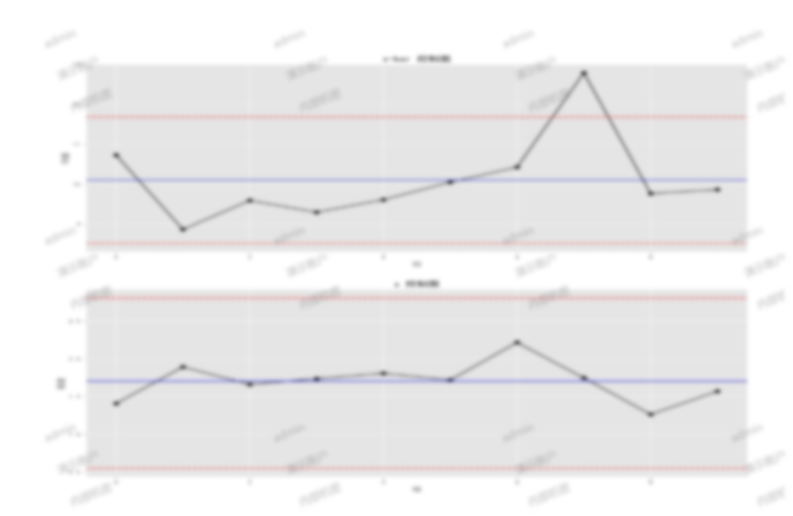
X-R analysis chart
Displays the X-bar analysis chart based on samples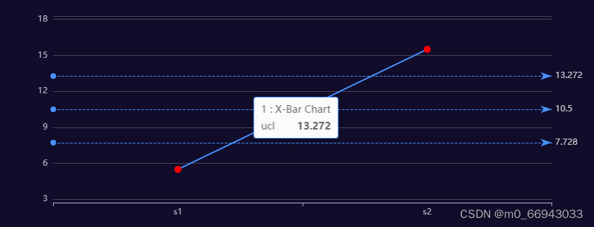
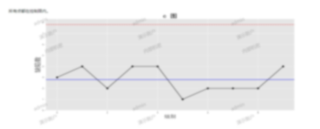
Range chart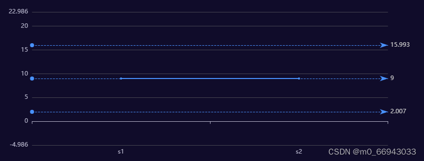
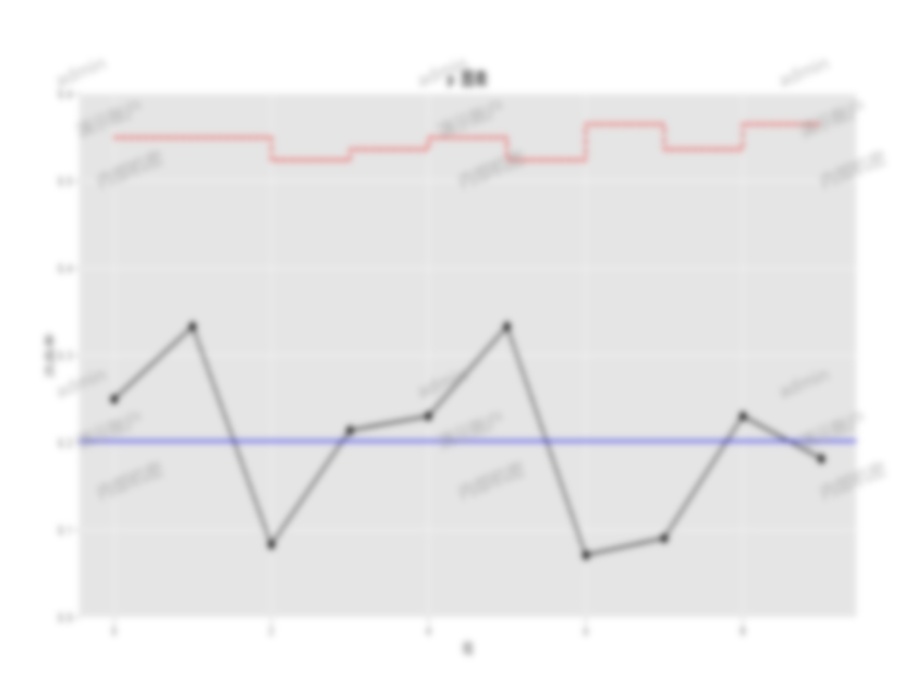
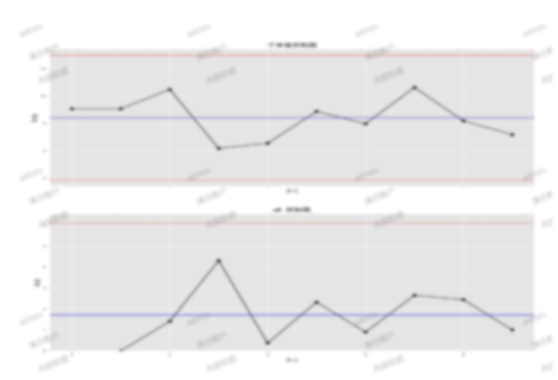
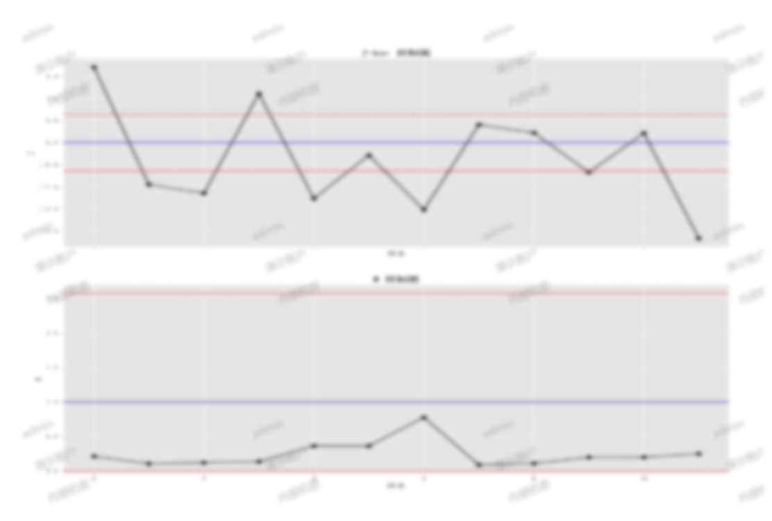
X-S analysis chart
Displays the X-bar analysis chart based on samples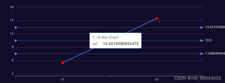
Standard deviation analysis chart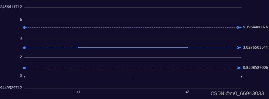
Statistical methods include
Cpk Cp CpL CpU
Ppk Pp PpL PpU
Contact Information
- Contact Info
- Email: flexiblebi@163.com
 Scan to apply for a trial
 - Product Website Link
Appendix
Product Specifications
- OS Requirements: Windows, Linux, Mac OS
- Supported Browsers: Chrome, Firefox
FAQ
- Q: Does the system support private deployment?
- A: Yes, our system supports private deployment to meet customer needs for data security and privacy.
- Q: Does the system support private deployment?
We look forward to collaborating with you to improve product quality.
Professor Liu
Mechanical Engineering Expert
An authority in the field of mechanical engineering, with research interests spanning mechanical design, automation systems, and intelligent manufacturing.